One flyer, two kinds of image
Our weekly-talk flyer lives in this repository twice: a 1,421 KB PNG and an 843 KB PDF. The smaller file keeps its words razor-sharp at any zoom, forever. It also has 72 DPI pixels smuggled inside it — coarser than the PNG it beats. Every number on this page is measured from those two files, and together they explain what an image actually is.
One flyer, two files
Every image on every screen is one of two things: a raster — a grid of coloured dots — or a vector — a list of instructions for drawing shapes. Most people meet the difference the day a logo prints blurry on a banner. We can meet it somewhere closer to home: the same AgenticGHX flyer, exported both ways by the same pipeline, sitting in our repository.
The PDF is 40% smaller. Now zoom both files into the flyer's biggest word — a placeholder, as it happens — at exactly the same magnification. The words below are the two files rendering the same region of the same design:

Tap the buttons to flip between the two files. Same region, same zoom, rendered by the same tool. Look at the edges of the small grey line — the PDF's letters stay clean; the PNG's are already softening, and they only get worse from here.
The smaller file has the sharper text — at any zoom, because instructions can be redrawn at whatever size you ask. That looks like a clean victory for vector. It is about 80% of one, and the missing 20% is the most useful part of this page.
Raster, under the hood: a grid of numbers
A raster image stores no shapes, no letters, no "background" — only a grid of pixels, and for each pixel, numbers: how much red, green and blue. That is the entire representation. Here is an actual window of the PNG, 22 pixels wide, taken where the big word meets the background — tap any pixel to read its real stored values:
These 308 colour values were read straight out of finn-flyer.png at the left edge of the big word. The cream pixels are the letter; the dark ones are the background; the in-between ones on the boundary are anti-aliasing — the file's only way to fake a smooth edge with square dots.
Multiply the grid out and you get the file's true weight. Three bytes per pixel, before any trickery:
size of finn-flyer.png on disk = 1.4 MB
The 12× gap is lossless compression: PNG finds repetition in the numbers (that huge near-black background is very repetitive) and stores the pattern instead of the copies. Unpack it and you get every pixel back exactly. JPEG, in the next sections, makes the other trade: it throws detail away for a smaller file, and what it throws away never comes back.
This is why raster images have a native size. The grid is the picture. Display it bigger than the grid and something has to invent the missing dots — which is the softness you saw in Section 0.
Vector, under the hood: a list of instructions
A vector image stores what you meant: rectangles, curves, text, colours — as instructions a renderer executes at whatever size it is asked. The national flag of Ghana, as an SVG our build script generates, is short enough to read in full. This is the entire file:
loading flag.svg…


Drag the slider. The SVG side re-executes its four drawing instructions at the new size — edges stay perfect. The PNG side has only its 150×100 grid of dots, so the browser stretches them into visible blocks. Neither file changes; only the size you demand of it.
The byte economics follow directly. Those 398 bytes of SVG draw a flag at billboard size. A PNG of the same flag at just 1620 pixels wide costs 14 KB — 36× more — and still has a native size it cannot exceed. When a design is made of shapes, flat colour and text, instructions beat dots by orders of magnitude.
Inside the "vector" PDF: a hybrid, measured
Now for the quotes around "vector". Our flyer PDF was produced by Chrome's print-to-PDF from an HTML design. Opening it up and listing what is actually inside:
Every raster layer the PDF carries, with the resolution it works out to on the page. The PNG export of this same flyer is 192 DPI everywhere — so the PDF's big image layers are 2.7× coarser than the "worse" file.
So the honest anatomy is: the words are instructions, the pictures are pixels — CSS gradients and effects got flattened into 72 DPI images at print time, and the speaker photo was embedded at exactly the 323×404 pixels it arrived as. Which makes a prediction: zoom into the photo in both files, and the PDF's advantage should vanish completely. Same region, same zoom, once more:

Flip between them. No amount of tapping makes one sharper: both files bottom out at the same 323×404 photo. The PNG's copy is a little smoother, the PDF's a little blockier — different resampling of identical information.
That is the general law hiding in this flyer: a file format cannot add information. Text survives in the PDF because the instructions were never lost. The photo is identical in both because both inherited the same pixels. And the gradients are worse in the PDF than the PNG because the print pipeline rasterized them early, at 72 DPI. "Is it a vector file?" is the wrong question — the right one is "what happened to each layer on the way in?"
File formats, mapped to their families
Formats are just containers for one family or the other — plus rules about compression. The raster ones differ mainly in what they throw away. Here are the same pixels through every mainstream encoder — toggle between our two specimens, because the winner changes:
| Format | Family | Loses data? | Reach for it when… |
|---|---|---|---|
| JPEG | raster | lossy | photographs going to screens; universal support |
| PNG | raster | lossless | screenshots, UI, text-on-image, transparency |
| WebP / AVIF | raster | either mode | the web, when you control the pipeline — same quality, far fewer bytes |
| GIF | raster | 256 colours max | only for simple animation; never for photos |
| SVG | vector | lossless | logos, icons, diagrams, flags — anything made of shapes |
| hybrid | depends on each layer | documents and print, where text must stay text | |
| TIFF / RAW / HEIC | raster | varies | print masters and camera originals — the "keep everything" end |
What makes each kind — and which one you are secretly using
You rarely choose a family; the tool chooses it the moment the image is born. Cameras can only measure light on a grid — the world arrives as raster. Design tools work in shapes — designs are born vector, even when their users never hear the word:
Born as pixels (raster)
- Phone and camera photos — a sensor grid measuring light
- Screenshots — a copy of the screen's pixel grid
- Scans — a sensor dragged across paper
- Photoshop, GIMP, Krita, phone editors — tools that edit pixel grids
- AI image generators — they output pixel grids too
Born as instructions (vector)
- Figma, Illustrator, Inkscape — shape-and-path editors
- Canva — vector under the hood, though it exports you a PNG
- Fonts — every glyph is a tiny vector drawing
- Code — HTML/CSS, SVG, matplotlib, plotting libraries
- This flyer — born as — of HTML/CSS
The flyer's true source is neither the PNG nor the PDF — it is the HTML file, which is smaller than both and can regenerate either at any resolution, any time. That file is the design; the exports are photographs of it.
What editing really does
Edit a vector and you edit the instructions: move a point, retype a word, change fill="#ce1126". Nothing else is touched, and nothing decays. Edit a raster and you overwrite the numbers in the grid. Every filter you have ever used is arithmetic on that grid — most of them are a tiny matrix called a kernel, slid across every pixel, replacing it with a weighted mix of its neighbours:
Runs live on the photo from the flyer, in your browser. "Blur" averages each pixel with its neighbours; "sharpen" pushes it away from them; "find edges" keeps only where neighbours disagree. Every photo filter you own is a recipe like this.
Because raster edits overwrite the grid, what matters is what happens when you save. With a lossless format, nothing. With JPEG, each save re-approximates the image — and the folk wisdom says every save compounds the damage. We measured it, and the folk wisdom is half right. Twenty-five re-saves of the speaker photo at quality 85, two ways:
Quality measured as PSNR against the original — higher is closer; every −6 dB is roughly "the error doubled". Both chains save at the same quality setting, the same number of times. The only difference is a one-pixel crop before each save.
The mechanism: JPEG compresses in 8×8 pixel blocks. Open a JPEG and re-save it unchanged and the blocks line up, so the encoder mostly re-makes the same decisions — after 25 saves our photo had lost just 0.17 dB. But crop, rotate, screenshot or re-frame between saves and the block grid moves: every save becomes a first save on fresh data. One pixel of drift per generation cost 12.2 dB — the error grew roughly four-fold — and each additional share keeps digging. That is the real reason a flyer that has been through a few rounds of forwarding-with-edits looks the way it does.
Conversion: the one-way door
Vector → raster is called rasterization, and it is routine: pick a resolution, execute the instructions, keep the dots. It happens every time a vector is displayed at all — your screen is a raster device. Ask our one PDF for the flyer at four different resolutions:
One source file, any output size, decided at conversion time. Note the 300 DPI row: more pixels than the original 192 DPI export (3375 wide against 2160) yet fewer bytes — because the 72 DPI layers inside don't grow any sharper, and smoothly invented dots compress well. More dots is not more detail (Section 3's law again).
Raster → vector is a different animal. The instructions were never in the file, so software has to guess them from the dots — it is called tracing, and here is the standard tool, potrace, run on both our specimens:

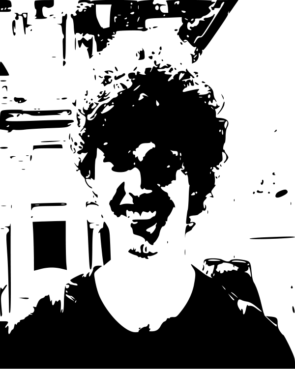
potrace 1.16 in its standard single-threshold black-and-white mode. Colour tracing exists and does better on flat-colour art — on photographs it produces the same lesson with more steps.
So the door only swings one way. Keep sources vector for as long as possible; rasterize as the last step, per destination — and when someone hands you a JPEG of a logo and asks for "the vector version", you now know that is a redraw job, not a conversion.
Where I was wrong — twice
This page's plan had a cleaner story in it, and the measurements broke it in two places. Both corrections taught more than the draft would have.
Wrong the first time: the headline. The draft said the PDF was "863 KB and sharp at any size." Twenty lines of inspection code killed the second half: six embedded raster layers, full-page ones at 72 DPI — the "sharp at any size" file carries pictures at about a third of the PNG's resolution, and the photo zoom in Section 3 shows the two files bottoming out identically. The lesson that replaced the headline is better than the headline: vector-ness is a property of layers, not of files, and the only way to know what a file really holds is to look inside it.
Wrong the second time: I expected tracing to bloat. The plan predicted the traced photo would "explode" into a huge SVG. The opposite happened — 35 KB of SVG against the photo's 57 KB of JPEG, a smaller file. What exploded was the information, not the bytes: the trace is crisp, scalable and no longer a photograph. A smaller file had destroyed the image. That corrected a lazy equation this page might otherwise have taught you: file size is not fidelity — in either direction.
Check your understanding
The lesson at a glance
Where these numbers come from
Every figure was computed by website/scripts/build-images-data.py from the artefacts in this repository, offline, and written into this page as data. The zoom evidence was rendered by the same script. Encoder versions are recorded in the data blob because byte counts depend on them. Built . The two artefacts themselves: the PNG (1.4 MB) · the PDF (843 KB).

Same discipline, different question
Where this sits: this is the second AgenticGHX explainer measured entirely from artefacts we own. The first thing we ever measured this way was text itself — the token tax shows the same sentence costing 2.55× more in Ga than English, and the compute gap prices the hardware all of these pixels run on.
The sequel to this page: when vector stops winning takes the same two families and asks which one to choose — across a logo, a chart and Ghana's 260 districts — and finds the exact point where the usual advice reverses.
This is one of the interactive explainers we make at AgenticGHX — talks, learning tracks, and research out of Ghana.
More from AgenticGHX Learn →