When vector stops winning
Every tutorial says the same thing: vector graphics are small, and they scale forever. Both halves are true right up until they aren't. Here is a scatter plot where the vector file is bigger than the raster — and where adding more data makes the raster file smaller. One rule explains that, a flag, and a 27 MB map of Ghana's districts.
Three pictures, one question
Every picture on every screen is one of two things. A raster is a grid of coloured dots. A vector is a list of instructions for drawing shapes. Most advice stops at "use vector when you can", which is where the interesting part starts.
Here are three real pictures. For each one, guess which version is the smaller file — the vector, or a good-quality raster of the same thing. Commit before you scroll; the answers are worth more if you have something to be wrong about.
Raster: a grid of numbers
A raster file stores a rectangle of dots. Ghana's flag as a image is — and that file knows nothing about flags, stripes or stars. It knows the colour of each of its dots and nothing else.
Two consequences follow immediately, and they are the whole of raster behaviour. The size of the file depends on how many dots there are — the width times the height — and on how hard those dots are to compress. And the picture has a native size: display it bigger than it was stored and something has to invent the dots in between.
Vector: a list of instructions
A vector file stores what to draw. Here is the entire Ghana flag — the real file this page uses, not a simplification of it:
loading…
Nothing in there is a dot. rect means "fill this rectangle", polygon means "join these corners". Ask for the flag at 60 pixels or at 6 metres and the same four instructions are re-executed at that size. The file does not know what size it is, which is exactly why it never blurs.
And the cost follows just as directly: a vector file's size depends on how many things it has to describe. Four shapes is four shapes. Six hundred thousand shapes is a different story, and that is the rest of this page.
The rule
Those two paragraphs are the whole thing. Put side by side, they predict every result on this page:
Neither one scales with the other's variable. That is why the answer flips: a picture with few things is cheap as vector at any size, and a picture with very many things is cheap as raster at any complexity. Somewhere between the two, the curves cross.
The next three sections are that rule under test — once where vector wins enormously, once where the two cross, and once where raster wins by more than an order of magnitude.
Few things: the logo
The flag has four shapes, so the rule predicts vector wins, and wins by more the bigger you go. Drag the slider: both panels are the same flag, but the right-hand one is a raster being stretched.


Many things: the chart
Now the same drawing, over and over, with only one thing changing: how many points are in it. Same figure size, same dots, same everything else. Every marker is one more instruction the vector file has to write down, and not one more dot for the raster to store.
Drag through the sweep. The vector line climbs forever; the raster line climbs, flattens, and then comes back down.
Very many things: the map
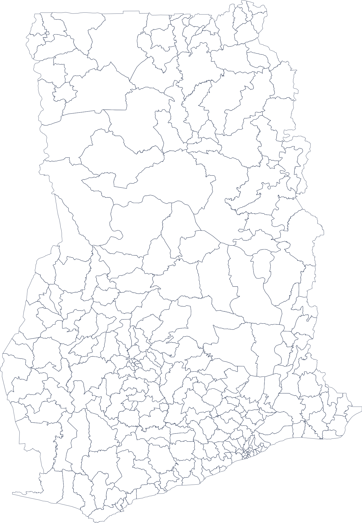
Ghana's districts, as published by geoBoundaries. Every wiggle of every boundary is stored as a corner, and there are of them — about bytes each. That is a vector file of , or gzipped. The same map drawn as a -pixel picture is .
The raster is smaller, and this is the rule working exactly as advertised: 661,763 things is a lot of things, and the number of dots never changed.
Now watch what happens when you throw corners away. Drag the slider — the left panel is the rendered map, the bars are the two file sizes:
Four things people say about this
Each of these is repeated constantly, each is half right, and each has a number on this page that kills it.
What to send, and to whom
The rule turns into a decision you can make in about four seconds: count the things in your picture.
Where I was wrong
Both of these were live in the measurement before the page was written, and both pointed the way I already expected — which is exactly why they took a while to catch.
Check your understanding
The lesson at a glance
Where these numbers come from
Every figure was computed by website/scripts/build-rastervector-data.py, offline, and written into this page as data. One drawing is exported as a vector master and then rasterised from it, so the vector and raster rows describe literally the same picture rather than two pictures that resemble each other. Every file-size comparison is gzipped on both sides. Library versions are recorded in the data blob, because byte counts depend on them. Built .
Same discipline, different question
Where this sits: the companion to this page is one flyer, two kinds of image, which takes a single file apart instead of choosing between three. If a word here was new, the glossary has it in plain English.
This is one of the interactive explainers we make at AgenticGHX — talks, learning tracks, and research out of Ghana.
More from AgenticGHX Learn →